Top 5 Trends in Website Design
Hey there, e-friends! Isn’t it fascinating how swiftly things evolve in the world of tech? The same applies to the arena of website design. As we draw nearer to 2024, we’re seeing innovative trends that are truly transforming the way we interact with online platforms. Let’s take a deep dive and uncover the top 5 defining website design trends for 2024!
Definition of Website Design
Web design is far more than just a digital presentation. It’s the art and science of crafting digital experiences, combining aesthetics, functionality, and user-centricity. In simpler terms, website design consists of various skills and disciplines necessary for producing and maintaining websites. This includes:
- Interface design.
2. Graphic design.
3. User experience design.
4. Search Engine Optimization (SEO).
Importance of Keeping Up with Design Trends
Why should we bother about the latest web design trends? For starters, an outdated website can be a turn-off, making your audience hop off to your competitor’s site. Moreover, emerging trends often focus on enhancing user experience, indicating that staying updated could result in more engaged and satisfied users. But that’s not all; it also helps to streamline your website and keep your brand relevant! Isn’t that sounds cool? Stay with me, and let’s explore these fascinating website design trends together!
Trend 1: User Experience (UX)
User experience, often abbreviated as UX, is a widely recognized phenomenon in the digital realm that majorly influences the design of a website. At its core, UX is all about the overall feel that a visitor gets when they interact with your website. It extends from navigation and accessibility to loading speed and layout. The intention is to make the website as user-friendly as possible and to walk the user through the website effortlessly. As we look towards 2024, UX is set to become even more paramount in website design.
Examples of websites with excellent UX
Several modern websites are leading the way in excellent UX design. For instance, Dropbox is renowned for its clean and straightforward interface, making the process of storing and accessing files effortless. Mailchimp, a platform for automated marketing, is another great exemplar. It uses friendly, quirky language to guide users through complex tasks. Similarly, Airbnb’s website design shows why a good UX is not just about simplicity. It’s a blend of beautiful visuals, intuitive navigation, and personalized user experience, making the booking process enjoyable and easy.
Tips for improving UX on a website
So how can you improve the user experience on your website? Here’s a few easy-to-apply tips:
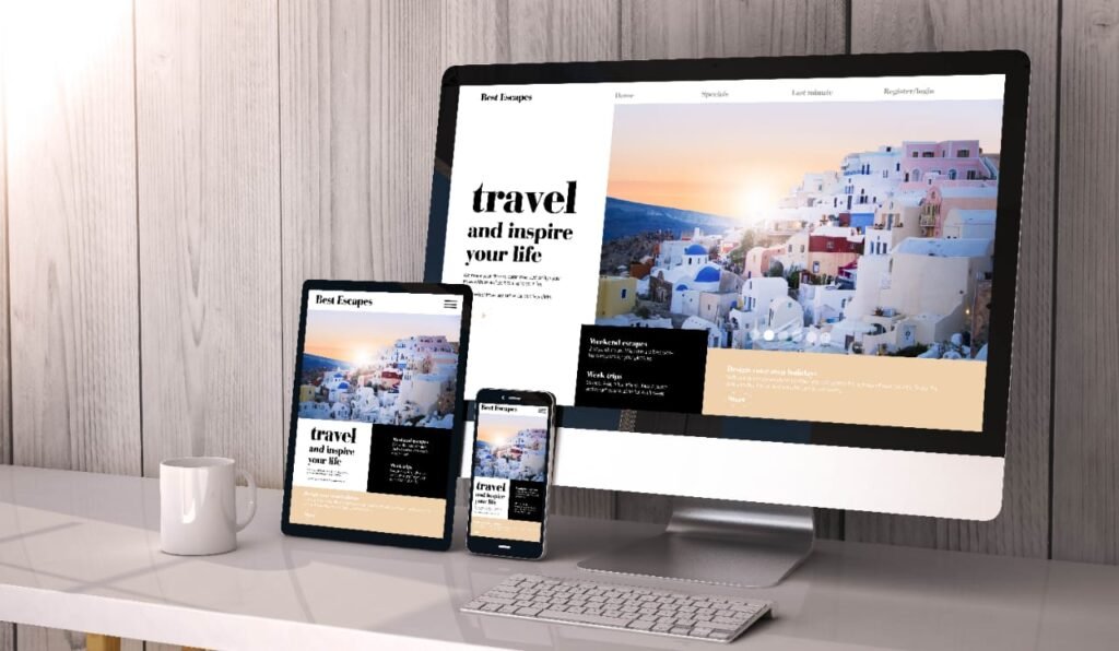
- Mobile-first design: Given the increasing use of mobile phones for web browsing, ensuring your website looks and works great on mobile devices is crucial.
2. Simplify navigation: Make it easy for users to find what they’re looking for quickly.
3. Use compelling, relevant images: High-quality stock photos for commercial use can add interest and provide context.
4. Faster load times: No one likes waiting for a website to load – the quicker, the better!
5. Dark mode option: With visual comfort becoming a major focus, offering a dark mode option can enhance UX for users who prefer a less glaring screen.
6. Minimize distractions: A minimalist design, free of clutter and unnecessary elements, can improve user focus and interaction. Remember, the key to UX is to keep the user in mind at all stages of design and not lose sight of making their visit seamless and pleasing.
Trend 2: Mobile-First Design
Website design has been rapidly shifting towards a mobile-first approach, and this trend is set to dominate in 2024. But what does this mean?
Explanation of Mobile-First Design Approach
Mobile-first design is a design philosophy that suggests designing the mobile version of a website before developing its desktop counterpart. With this approach, a designer starts by scaling down a website to fit the smaller screen size of mobile devices. The idea is to make sure that the most crucial web elements are viewable and functional on such devices. It’s like building a small, efficient home before designing the mansion!
Benefits of Mobile-First Design for Website Owners and Users
Adopting a mobile-first design comes with noticeable benefits. For website owners, it promises better visibility in search engine rankings. Why? Google adopted a mobile-first indexing approach in 2019, preferring sites optimized for mobile viewing. For users, a mobile-friendly site means a better browsing experience. The rise of smartphones has led to a dramatic increase in mobile web browsing. Hence, a mobile-first strategy ensures users can navigate the site easily, no matter the device they use.
Tips for Implementing Mobile-First Design
Considering moving towards a mobile-first design strategy? Here are some tips:- Emphasize Core Content: Make sure your essential content is front and center. Remember, smaller screens mean less space!
– Simplify Navigation: Streamline your site’s navigation to make it easy for users to find what they want.- Prioritize Speed: Mobile users can be impatient. Optimize your load times for a smooth and fast browsing experience.- Test, Test, Test: Always test your design on multiple screen sizes to ensure it looks good and works well on all devices.
Trend 3: Dark Mode
The dark mode is a theme that utilizes mainly dark surfaces in the user interface. It has recently gained massive popularity among various software and application developers, including website designers. Whether it’s social media apps, video streaming platforms, or even productivity tools, almost every application now offers an optional dark mode. Studies predict that by 2024, this feature will be a core aspect of website designs due to its modern touch and user appeal.
Definition and popularity of dark mode
Dark mode is a color scheme that uses light-colored typography, icons, and graphical user interface elements on a dark background. Initially embedded in the consoles of developers because it’s easier on the eyes, the dark mode theme quickly gained traction and popularity among the general public due to its sleek look and visual comfort.
Benefits and considerations of using dark mode in website design
Among the numerous benefits of using dark mode in website design:
– It can significantly reduce eye strain in low-light conditions.
– Dark mode can save energy (especially for OLED or AMOLED screens).
– It adds a fresh and modern look to a website. However, it’s essential to note that the optimal use of dark mode depends largely on the nature of the content presented. For instance, light mode might be more suited for long reads, while dark mode for visual-centric or short-form content.
Tips for designing websites with dark mode
Here are a few best practices for integrating dark mode into your website design:
– Always provide a light/dark switch for the convenience of the user.
– Test the design in both light and dark mode to ensure readability and proper contrast.
– For elements that need to stand out, consider using lighter shades or starkly contrasting colors against the dark background. Remember, incorporating dark mode is about providing options to your visitors and improving the overall accessibility of your website.
Trend 4: Minimalist Design
Web design trends are always evolving, and one major player set to dominate 2024 is minimalist design.
Definition and Characteristics of Minimalist Design
Also known as flat design, minimalist design is marked by the absence of unnecessary elements in a website’s layout. Its basis lies in the principle of “less is more”, where content and usability are prioritized over flashy visuals.- It uses ample amounts of space, and white space in particular, to highlight the main message without distractions.
– It employs a limited color palette, which helps create a mood and drive attention to key content.
– Flat textures, simple images, and clean, crisp typography are other typical features of minimalist web design.
Advantages and Examples of Minimalist Website Design
Minimalist designs offer several advantages. They are often faster to load and easier to navigate, leading to an improved user experience. They are also more adaptable to different screens, which makes them ideal for mobile-first design.For successful real-life examples, Apple’s website serves as an excellent paragon of minimalist web design. It’s simple, clean, and easy to navigate, with a judicious use of white space. Another example is the Squarespace homepage, which employs a restricted color palette to focus on the products.
Tips for Creating Minimalist Websites
Creating a minimalist website may seem easy, but it requires attention to detail and a keen eye for design:
– Plan your layout first, defining the most important elements that need to stand out.
– Use colors effectively but sparingly, and remember that whitespace is your best friend.
– Opt for simple and readable typography, and avoid overly decorative fonts.
– Prioritize functionality over form.The key is to keep it simple yet engaging. Every element of your design should have a purpose, which will allow users to understand and interact with your site effortlessly.
Trend 5: Innovative Navigation
Gone are the days of standard, boring navigation. As we venture into 2024, we see a shift to more innovative, creative, and user-friendly navigation techniques – and not without a good reason.
Importance of Navigation in Website Design
Your website’s navigation system is like a roadmap to all the different sections of your site. It not only guides visitors to the information they’re looking for but also helps search engines understand what content is important. However, creative and innovative navigation can do much more than guide users; it provides a great opportunity for designers to make a lasting impression and create a unique user experience. After all, convenience and user-friendliness can often turn a casual visitor into a devoted customer.
Examples of Creative Navigation Techniques
- Hamburger menus, especially those that morph into navigation options.
• Full-screen navigation designs that take over the entire page when activated.
• Vertical sliding navigation that moves independently of the site content.
• Drawers or sliding panels that glide into place when a menu icon is clicked.
• Parallax scrolling which creates an illusion of depth and a more interactive experience.
Tips for Implementing Innovative Navigation on a Website
If you’re aiming to incorporate innovative navigation on your site, making it intuitive is the first step. Ensure it aligns with your website’s overall design and is consistent across all pages. Keep it simple, as complexity can deter users. Finally, always maintain a mobile-first approach. This ensures your navigation system works well on all screen sizes and sets you up for success as mobile website traffic continues to rise. Remember, web design in 2024 is about creating an engaging, enjoyable experience for Users.
Conclusion
You’ve successfully journeyed with us through the fascinating labyrinth of leading web design trends for 2024. Let’s draw a quick sketch of these trends to keep them fresh in your mind.
Recap of the top 5 trends in website design for 2024
Firstly, user experience (UX) will take center stage. UX design will focus on being user-friendly, efficient, and intuitive. Secondly, the mobile-first design approach will intensify, emphasizing designing for smaller screens before translating it into larger ones. Thirdly, we’ll see greater use of dark mode, whose aesthetic allure not only soothes eyes but also conserves energy. Fourthly, minimalism in website design will hold its sway – the ‘less is more’ motto will reign supreme. Lastly, the trend of using stock photos for commercial purposes will be more prevalent as businesses strive to connect with their audience more authentically.
Encouragement to stay updated on design trends
Among the trillions of internet users, you owe it to your website visitors to keep up with trends. Remember, trends are not just about being in vogue; they’re also about meeting user expectations, enhancing engagement, improving loading speed, and making your website more user-friendly. So, refresh your learning, stay inquisitive, stir your creativity, and be prepared to sync your website with arising trends in design regularly.
Final thoughts on the future of website design
In essence, the future of website design lies in its ability to respond to user behavior and adopt new technologies. We have seen innovative trends like mobile-first design, user experience, dark mode interface, and minimalism shaping the web design industry. We anticipate that these trends will redefine digital interactions and create a more immersive and engaging web experience in 2024 and beyond. Remember, website design doesn’t always need to shout; indeed, the most influential design talks in whispers. So, tread gently, and let your design speak volumes about your brand.
he future of website design lies in its ability to respond to user behavior and adopt new technologies. We have seen innovative trends like mobile-first design, user experience, dark mode interface, and minimalism shaping the web design industry. We anticipate that these trends will redefine digital interactions and create a more immersive and engaging web experience in 2024 and beyond. Remember, website design doesn’t always need to shout; indeed, the most influential design talks in whispers. So, tread gently, and let your design speak volumes about your brand.
ALSO READ : Cracking the Code: Decoding Patanjali’s Business Mastery